
Nothing was renamed in your data. Connections, pipelines, entities, groups, and settings
all keep their names and values. The changes here are to layout and navigation only,
except where explicitly noted.
The short version
Sidebar labels
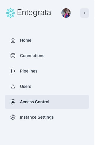
Two sidebar items were shortened, and the Pipelines icon changed.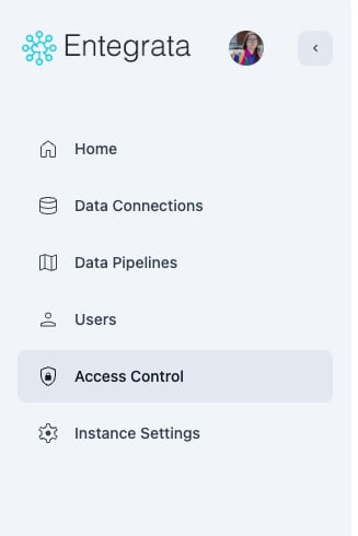
Before
After
- Data Connections is now Connections
- Data Pipelines is now Pipelines
Connections
The connections list
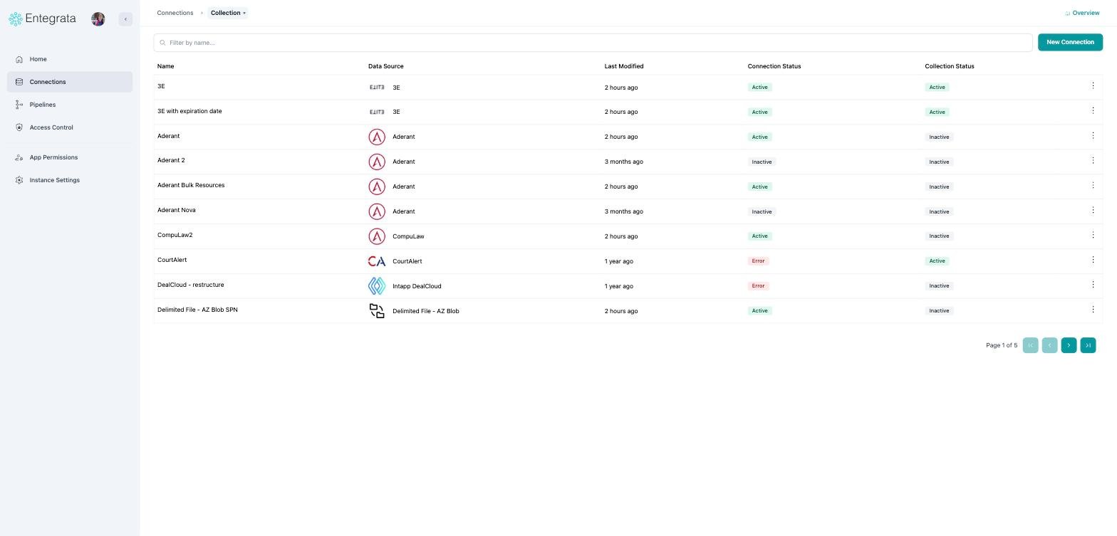
The page title and the tab strip are gone. Search moved up into the same row as New Connection, which leaves noticeably more room for your connections.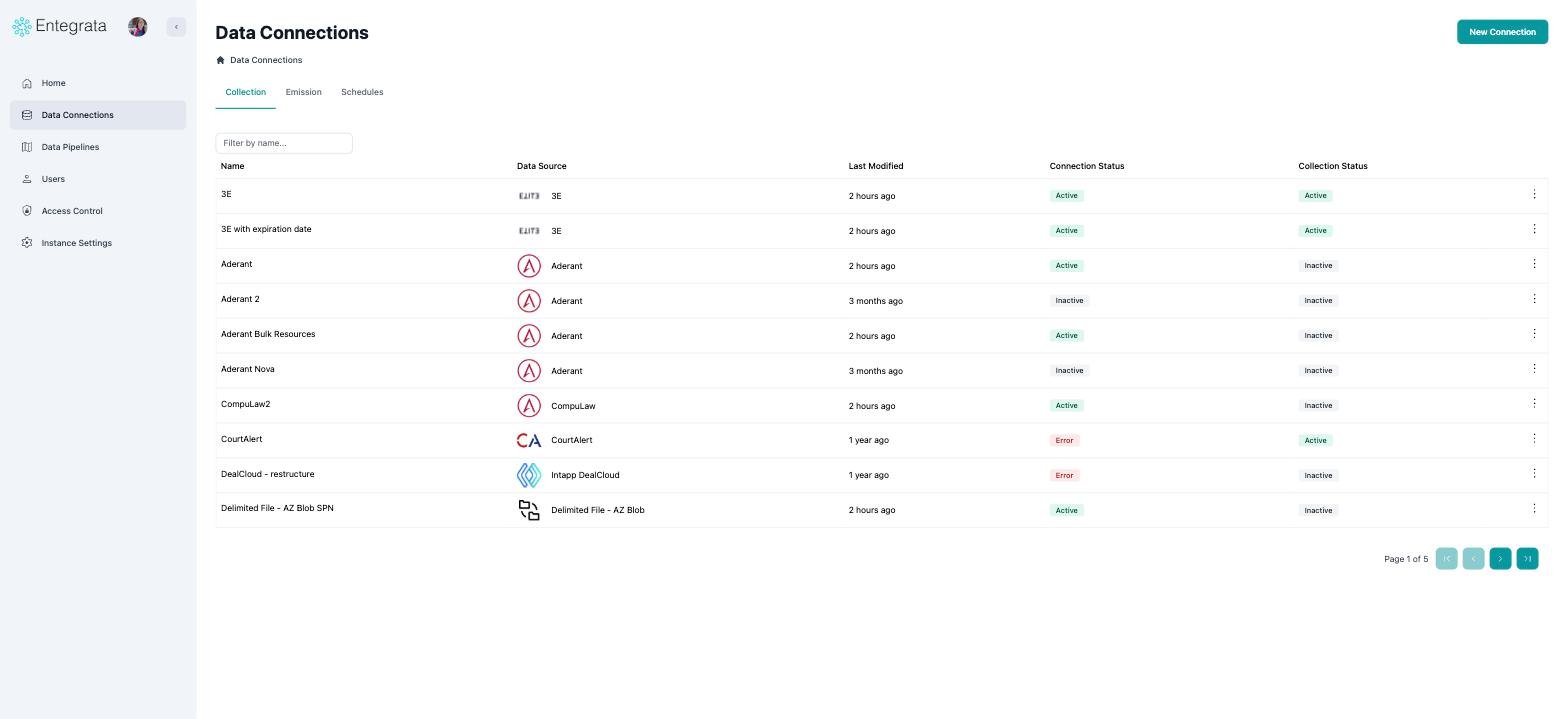
Before
After
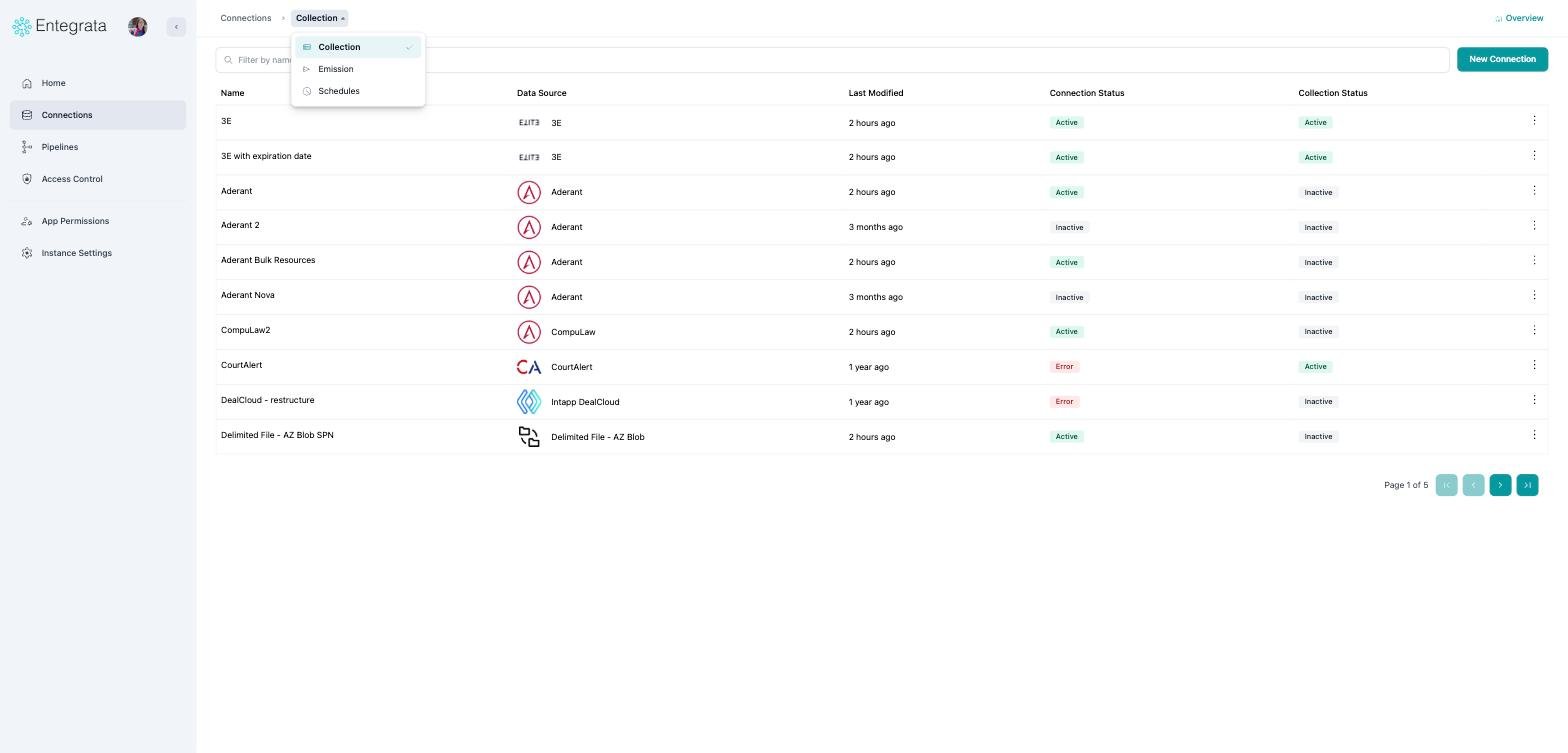
The old tab strip is now a breadcrumb menu
Connector health at a glance
New: click Overview in the top right for a summary of your whole connection fleet, one bar per connector, coloured by health, with counts and a short summary underneath.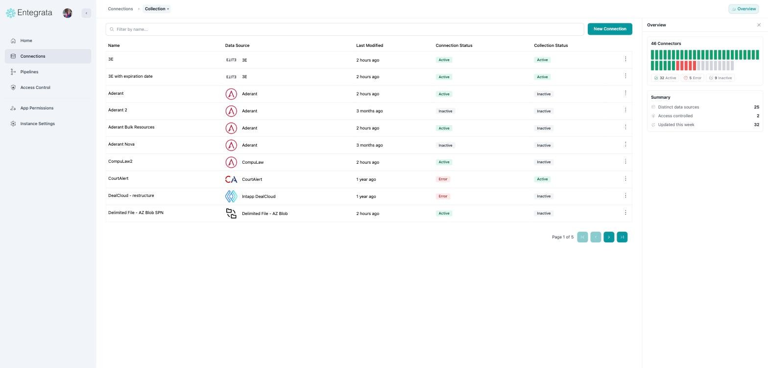
New Overview panel
Searching connections
Search works the same way and still matches both the connection name and its data source. Two things improved: results no longer re-query on every keystroke, and the term in the address bar is now a short, shareable?search= value.
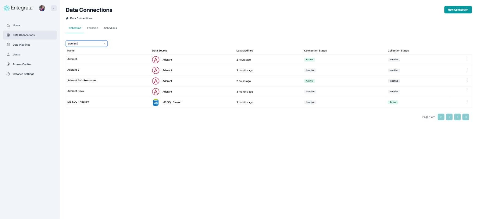
Before
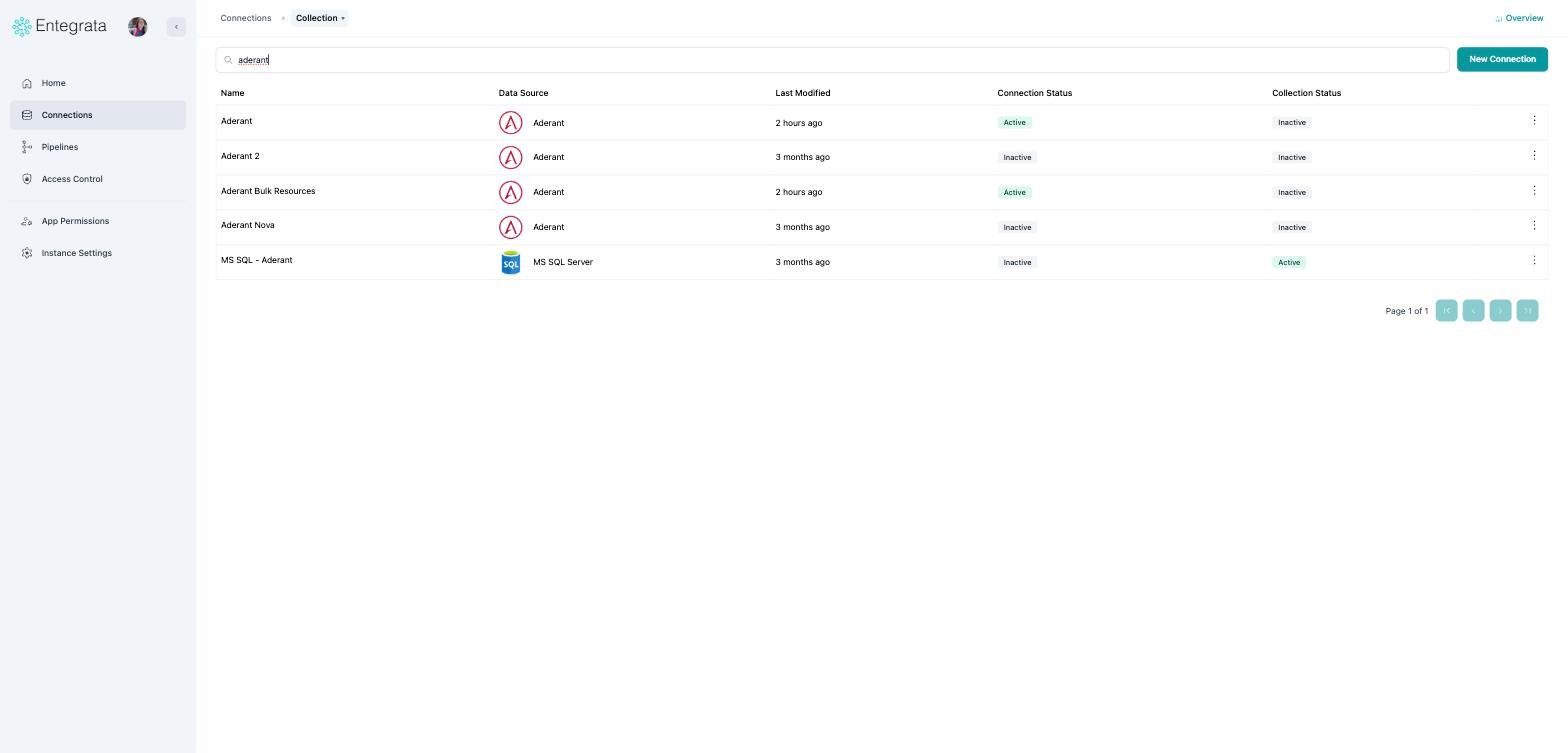
After
A single connection
The connection name is no longer a heading; it is the middle crumb in the breadcrumb. The five tabs became a menu on the last crumb, and the actions moved into the top-right corner.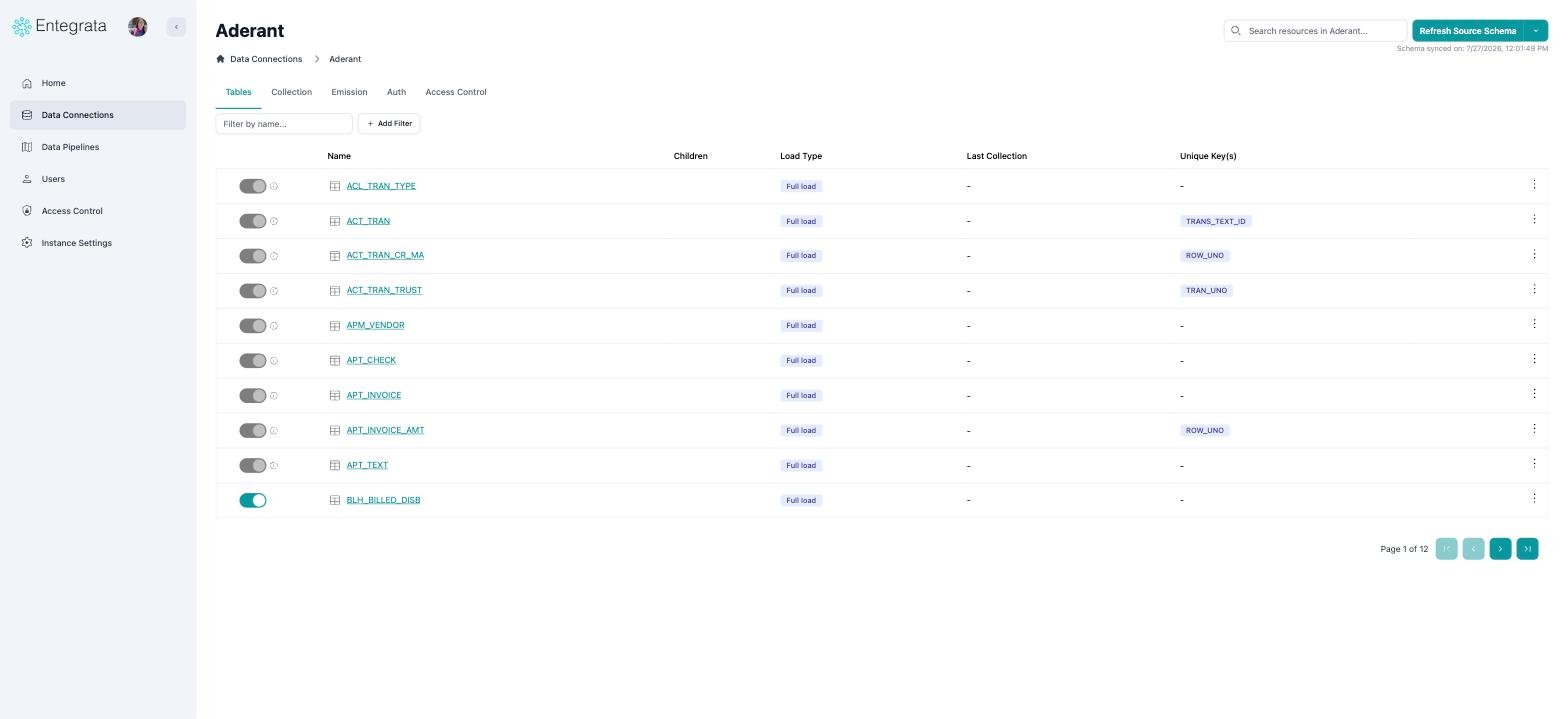
Before
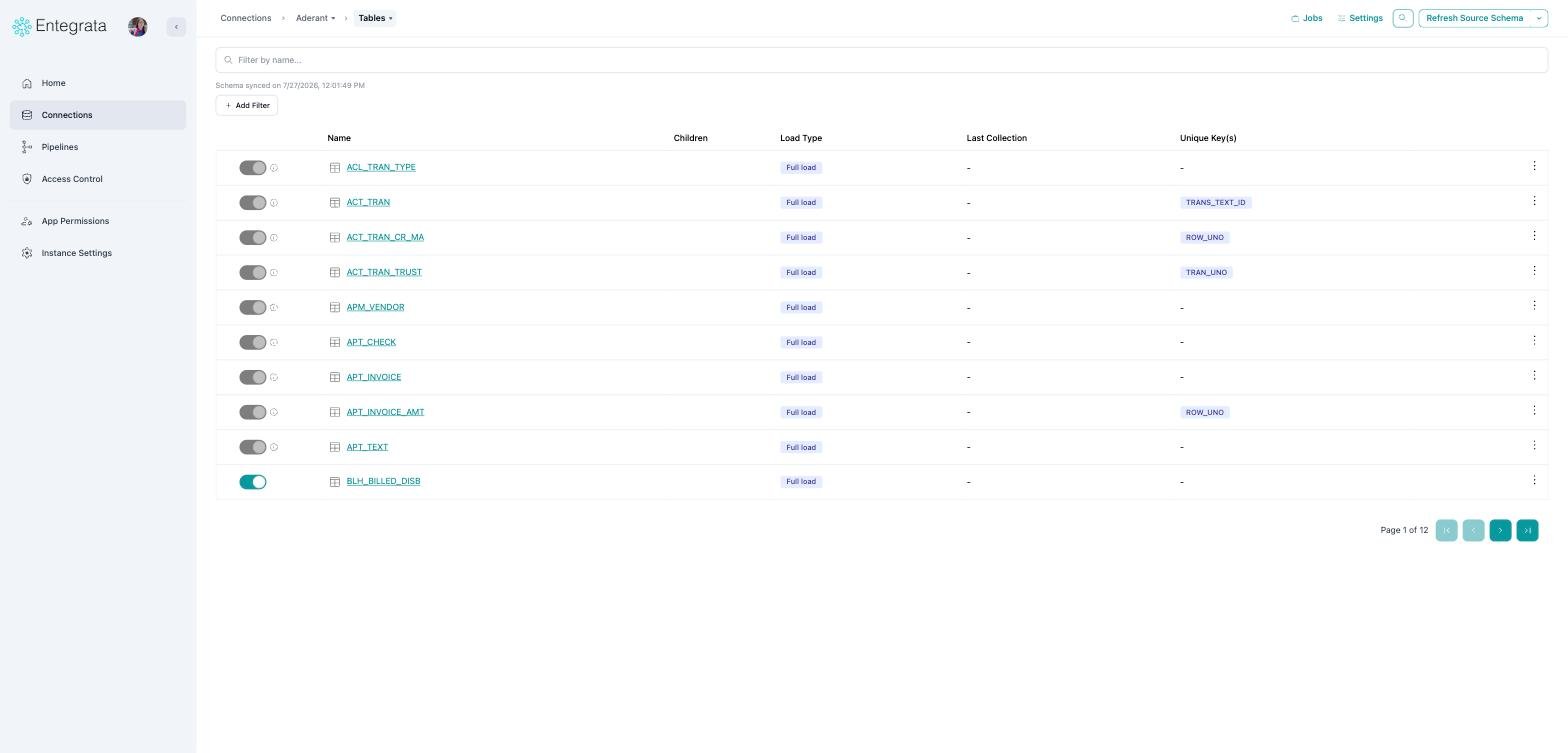
After
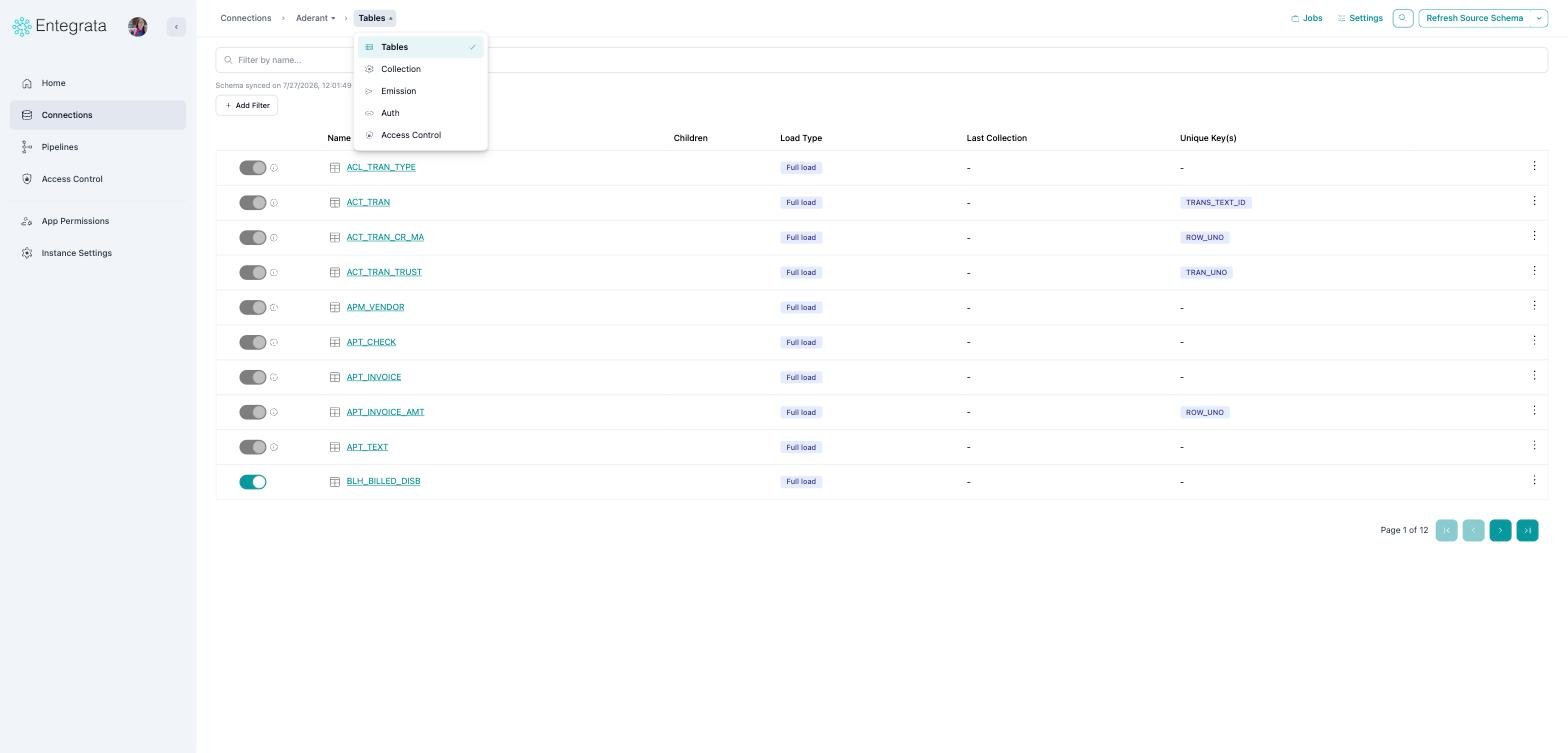
Tables, Collection, Emission, Auth, and Access Control are now one menu
Jumping between connections
New: the connection name in the breadcrumb is a searchable switcher. You no longer need to return to the list to open a different connection. Each entry shows a status dot, and the data source in parentheses where it differs from the name.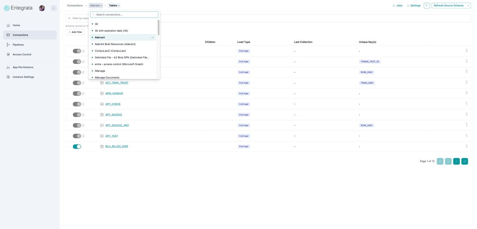
Every connection, with status
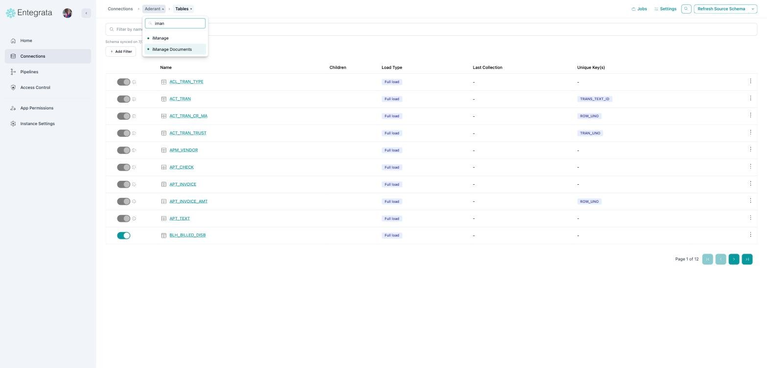
Type to narrow the list
Jobs and settings without leaving the page
Two new panels open from the top-right of a connection. Jobs shows what is running now or what ran last, counts by state, and the most recent runs. View all jobs opens the full job history.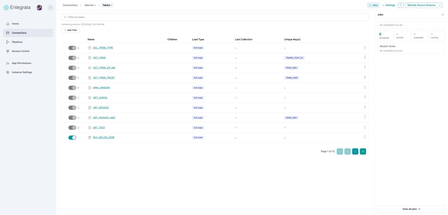
New Jobs panel
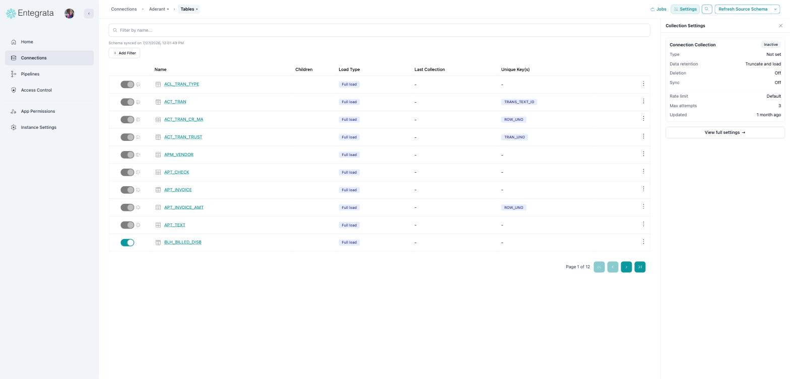
New Settings panel
Finding a table or field quickly
The old Quick navigate to resource box in the header is now a search palette. Open it with the magnifier in the top right, or press ⌘K (Ctrl+K on Windows).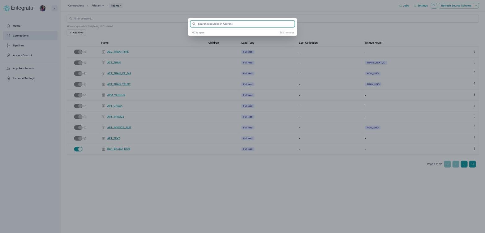
Opening the palette
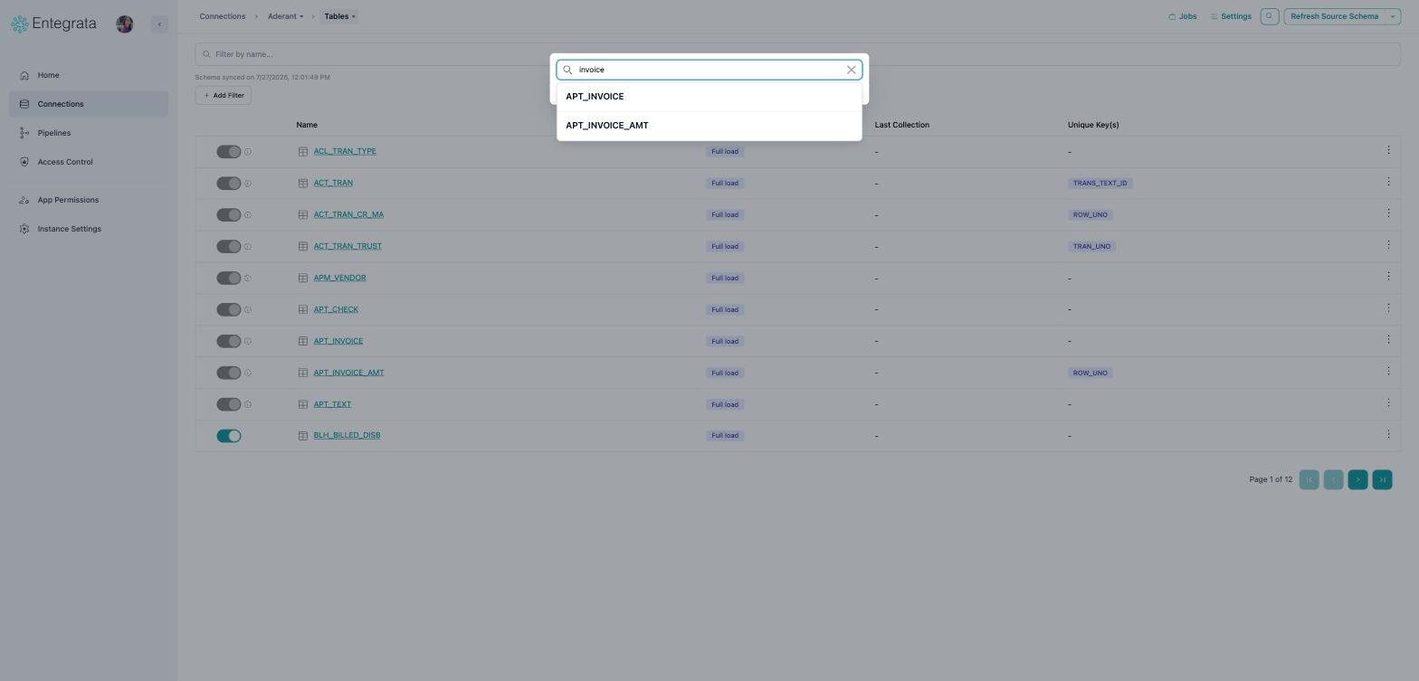
Searching the whole schema
Your filters and search on a connection’s resource and field lists are now remembered when
you switch tabs and come back.
Pipelines
The pipelines list
Same change as connections: no page title, no tab strip, and search sits with Create Pipeline. Switch between Pipelines and Catalog Queries from the first crumb.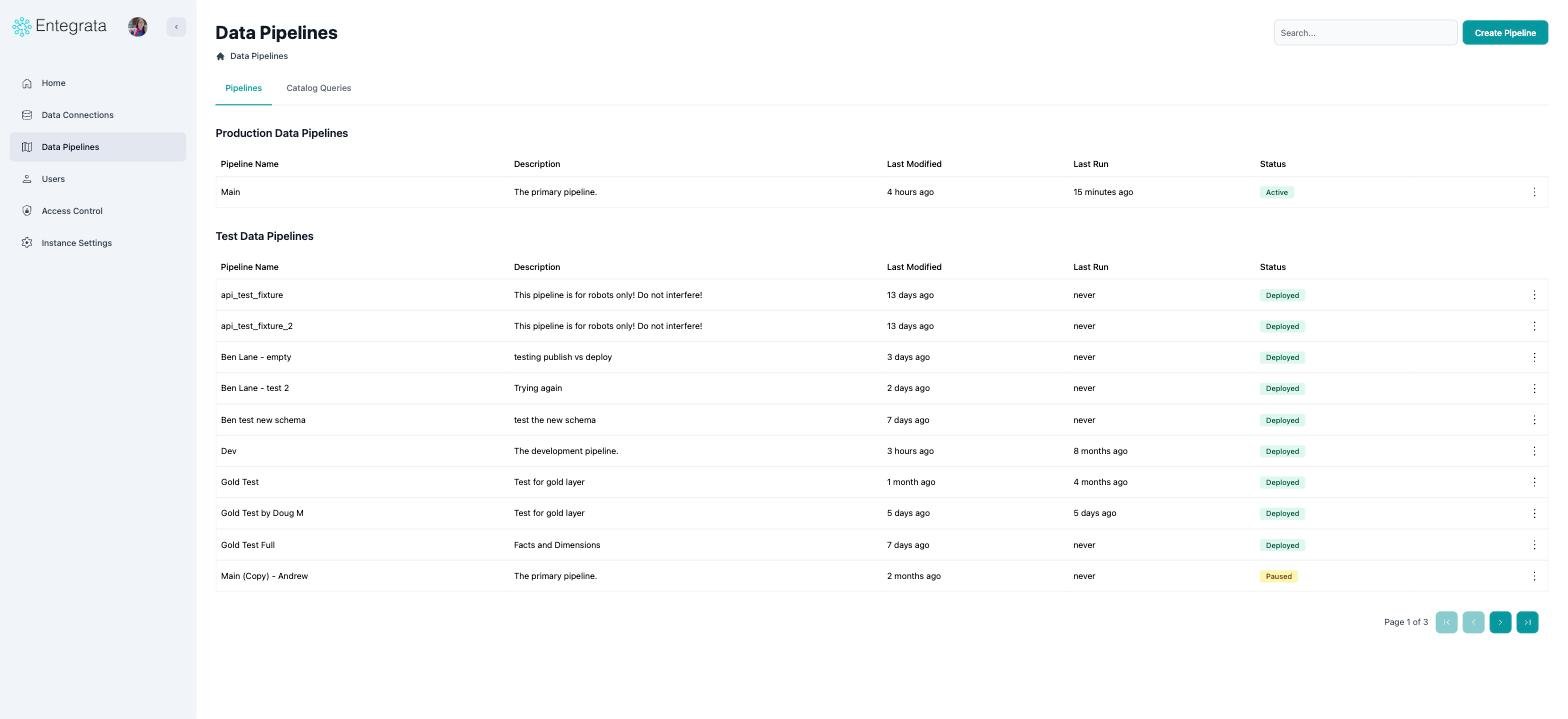
Before
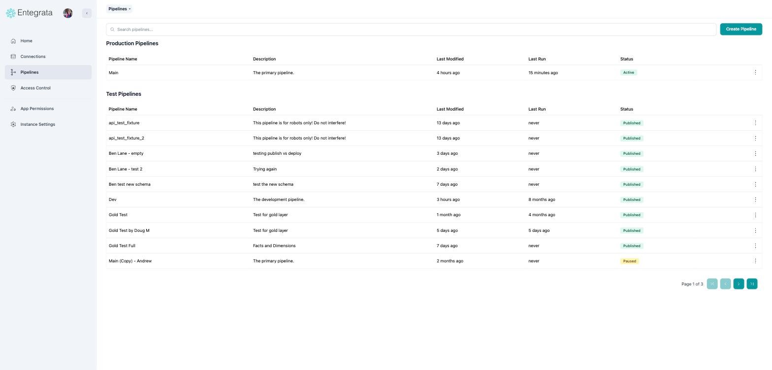
After
Opening a pipeline goes straight to its entities
Opening a pipeline used to land on a screen where you picked Silver before you could do anything. That step is gone: you now land directly on the Silver entities list.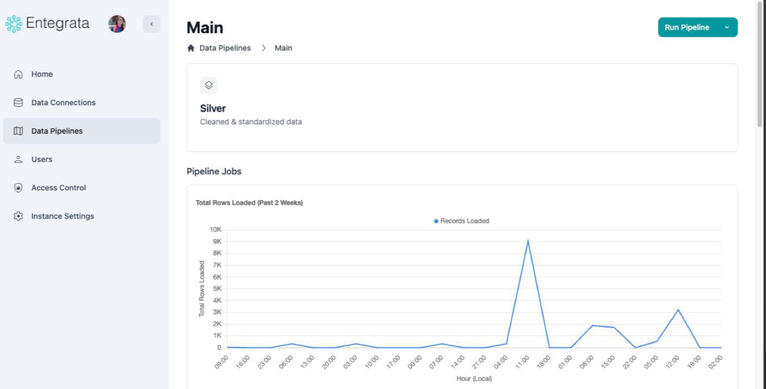
Before: pick Silver first
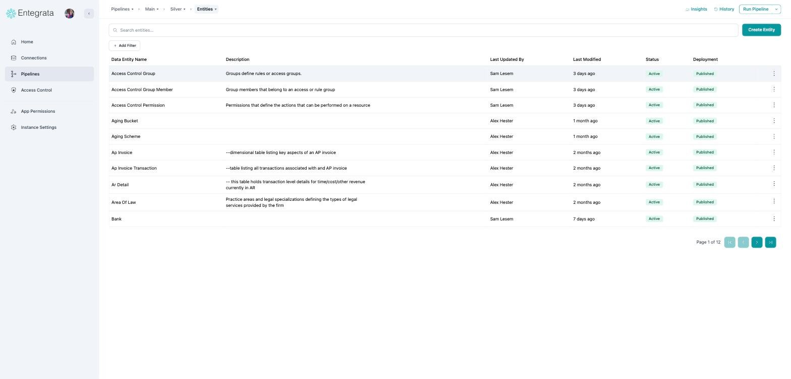
After: straight to the entities
Old links still work. A bookmark to a pipeline, or to
/silver, now forwards to the
entities list.Running a pipeline
Run Pipeline used to live on the Statistics page, which meant opening a pipeline, choosing a layer, and then switching tabs before you could start a run. It is now in the top right of the entities list, the page you land on. It also asks for confirmation before starting, naming the pipeline it is about to run.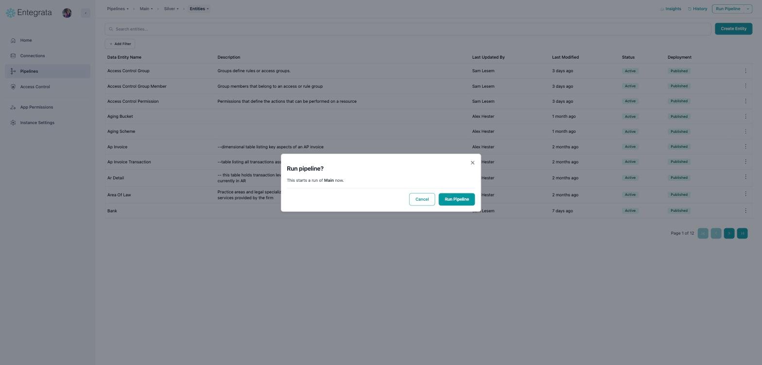
New confirmation step
Statistics is now Insights
The Statistics page became the Insights panel, which opens beside your entity list instead of replacing it. The four counters and the pipeline status block carry over unchanged, and recent runs are summarised with a link to the full job history.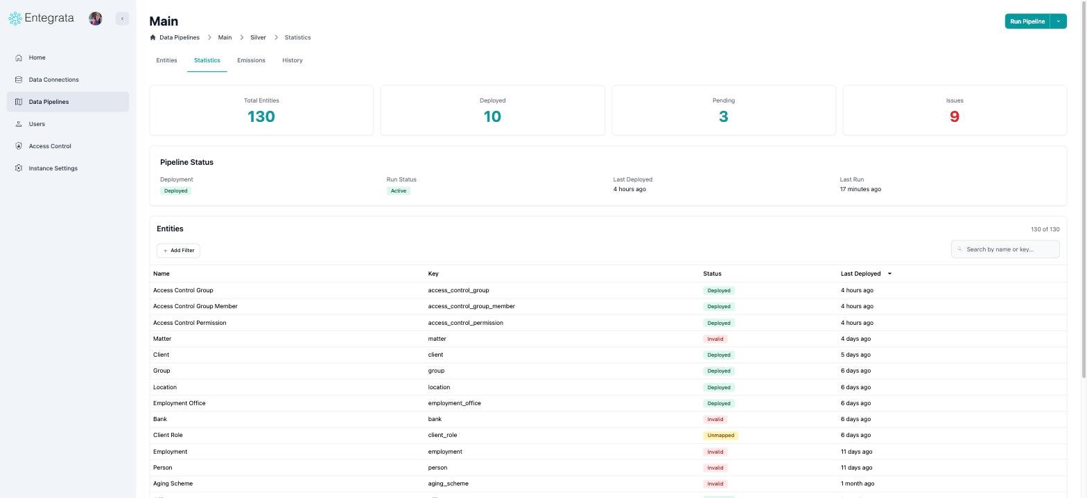
Before: the Statistics page
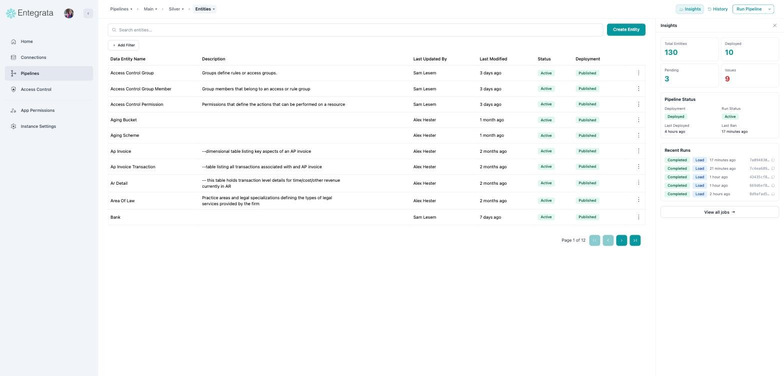
After: the Insights panel
History
Pipeline history moved into a History panel available from any pipeline page, and it is aware of where you are: on a list it shows the pipeline’s history, and on an entity it shows just that entity’s history.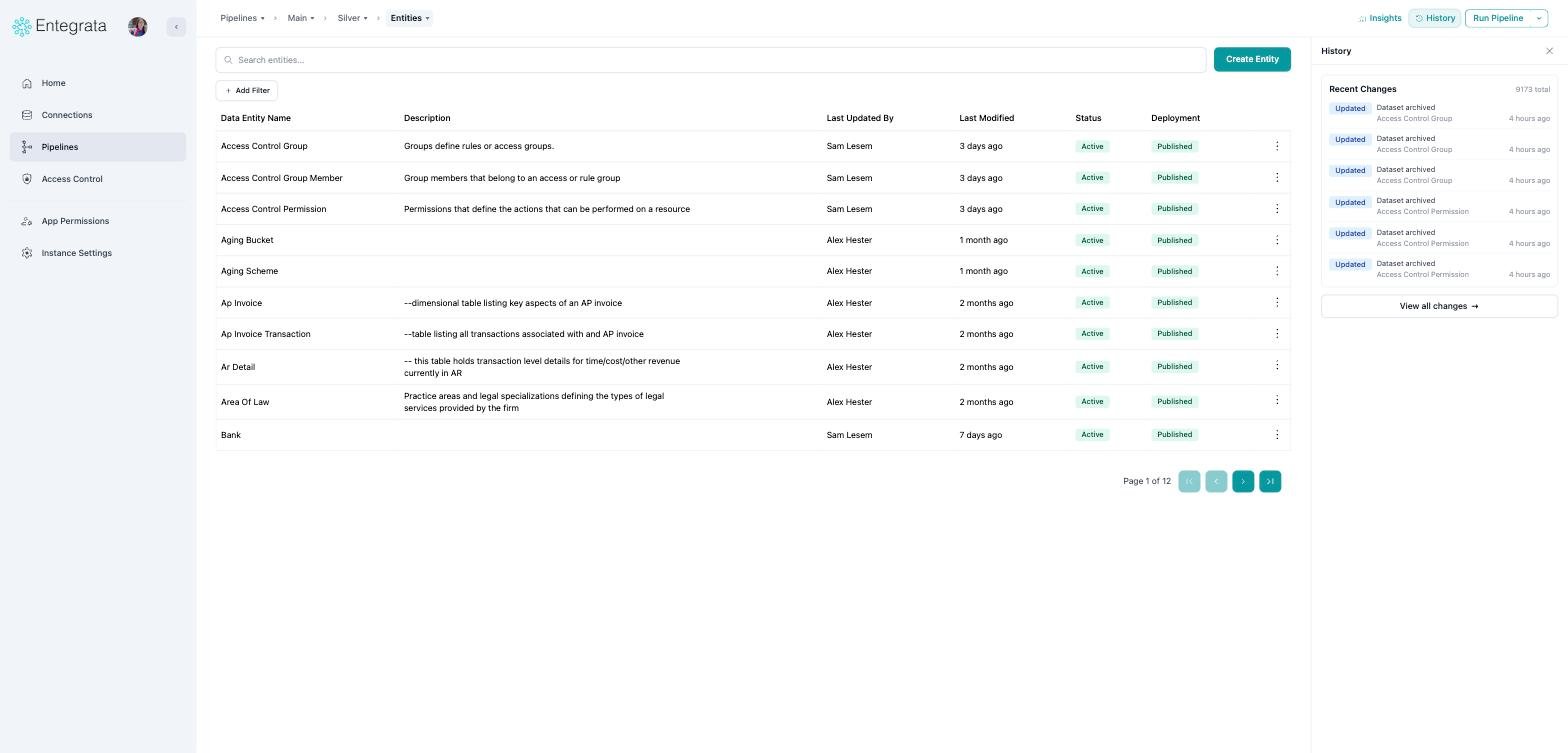
New History panel
Entity pages
On an entity, the Editor, Fields, Data Lineage, and Access Control tabs are now a menu on the last crumb, and the entity name itself is a searchable switcher for moving between entities. The entity’s History tab is now the History panel described above.Instance Settings
The settings cards
The cards are unchanged. Three of them, Data Encryption, Timezone, and Log Analytics Retention, now open in a window over the grid instead of replacing the page.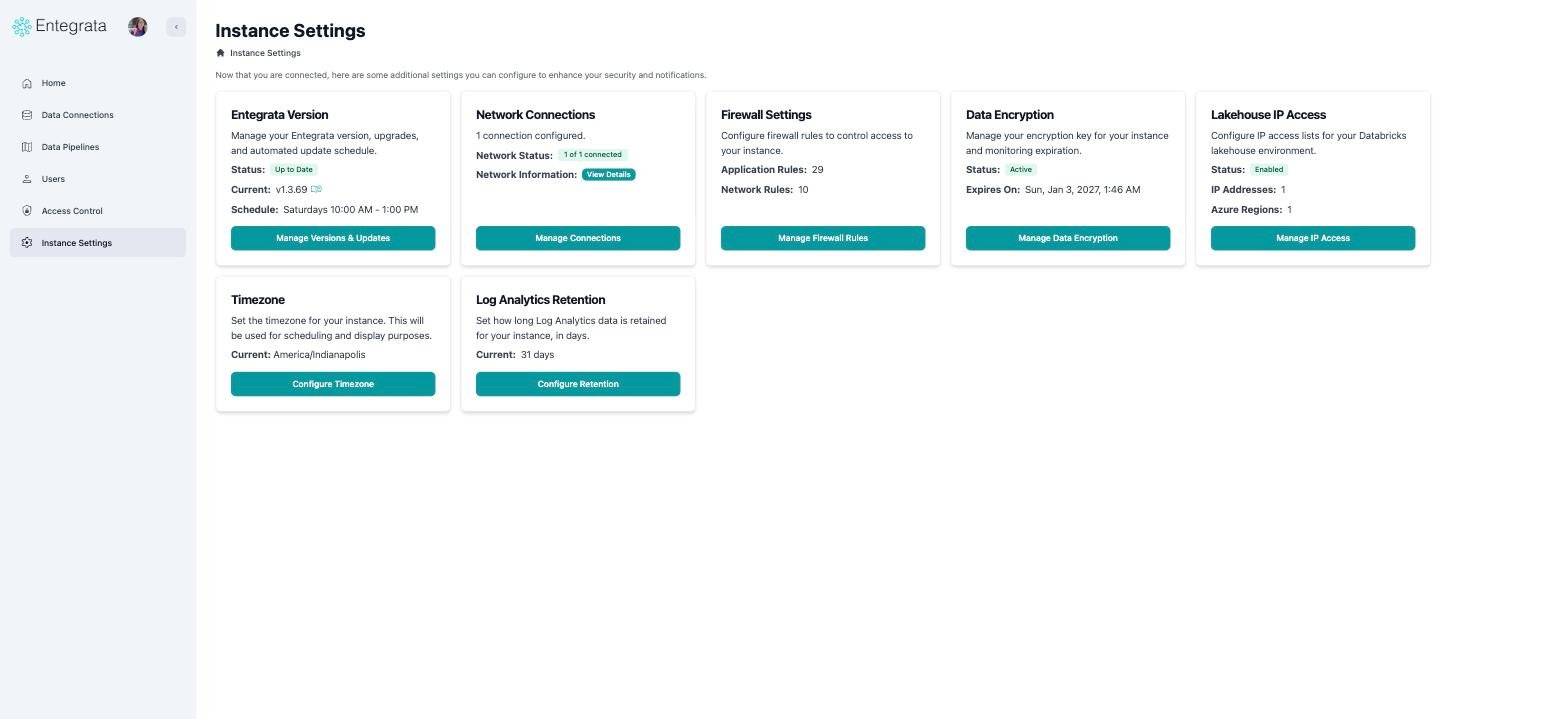
Before
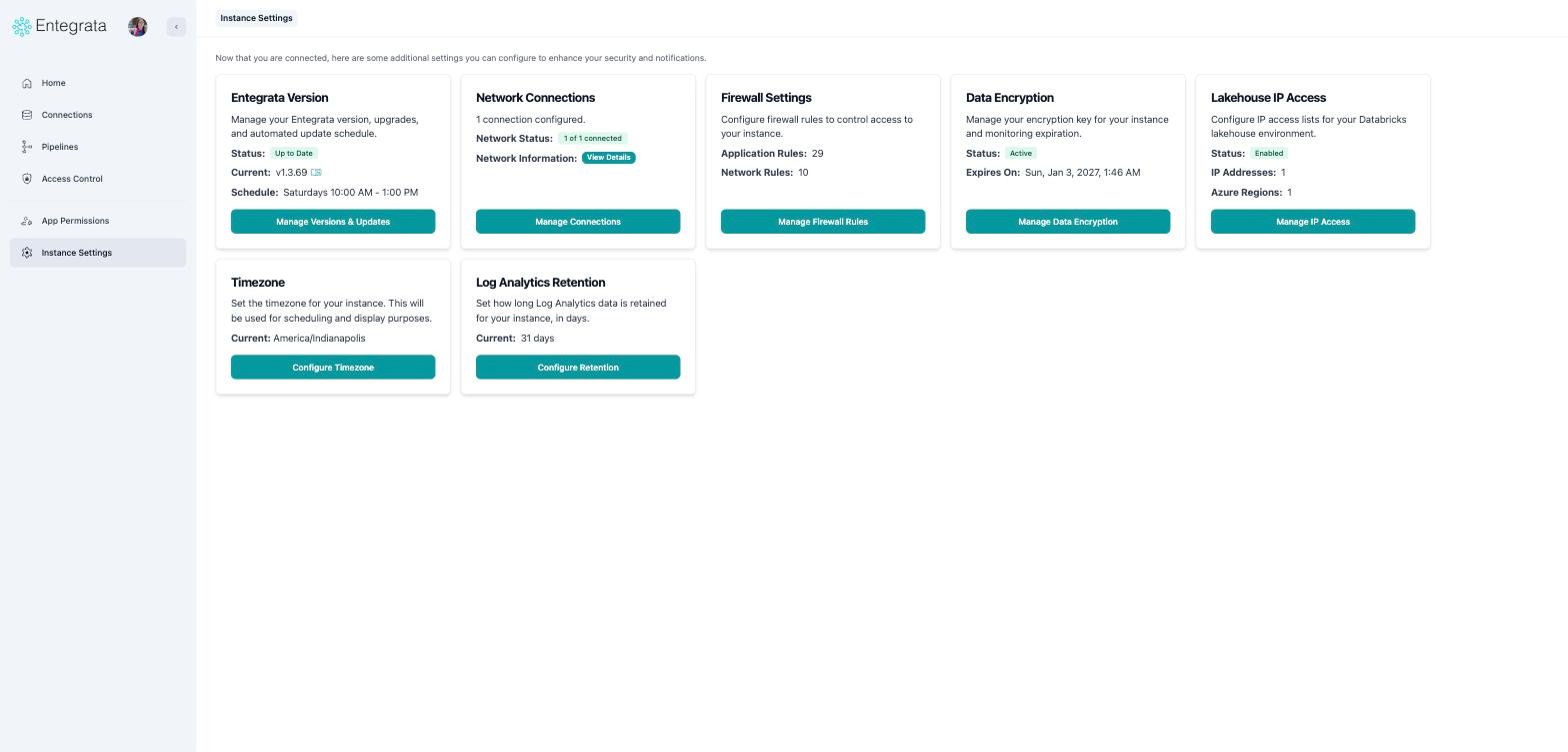
After
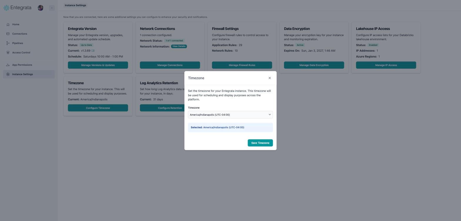
A shareable link to one setting
Firewall settings
All firewall functionality is unchanged. The Data Sources and System tabs moved into the breadcrumb, Apply Changes moved to the end of the breadcrumb row, and Add Data Source now sits beside a full-width search box.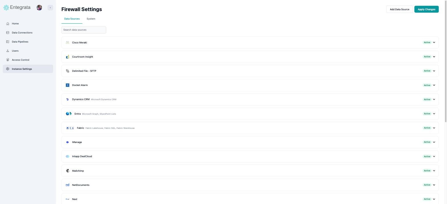
Before
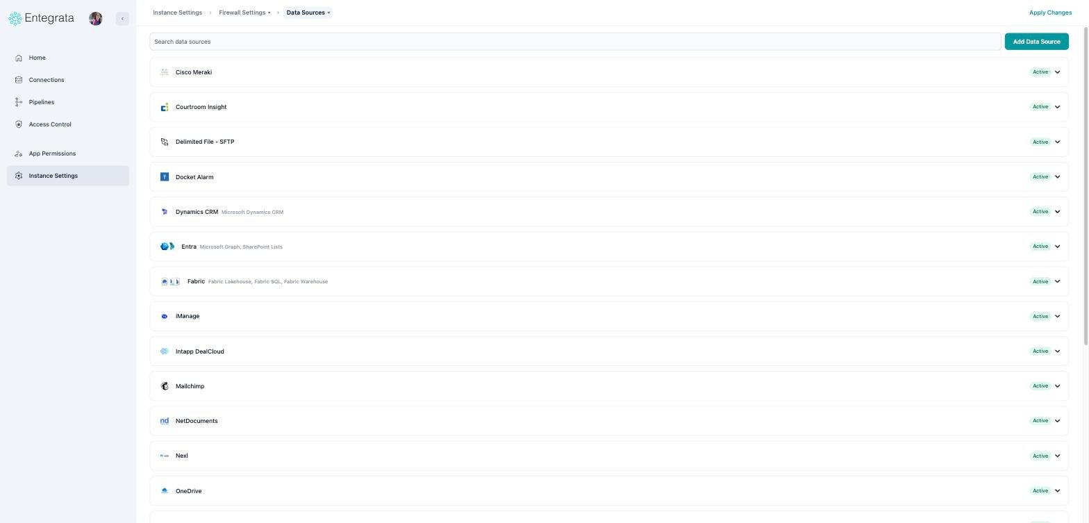
After
Network Connections
Network Connections is in the same place, reached from the Network Connections card in Instance Settings. It picked up the same chrome as the rest of the application: the page title gave way to a breadcrumb, and search moved into the row with Add Connection.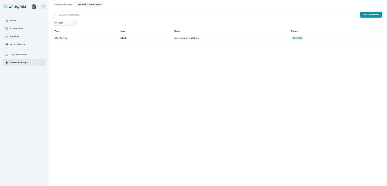
Network Connections on the new chrome
Users
The Users heading became a breadcrumb, and the generic search box became a labelled Search users box next to New User.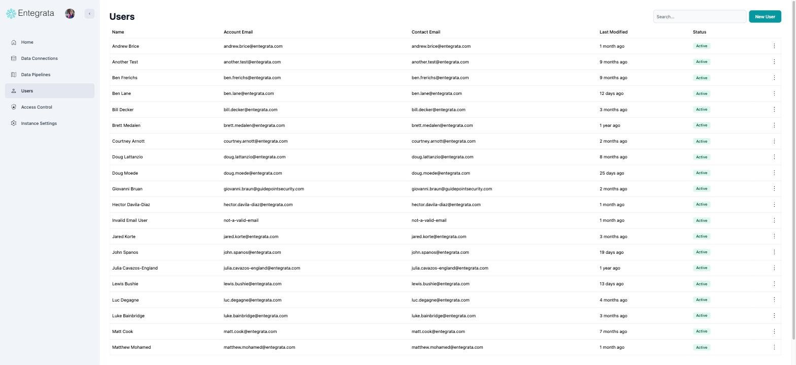
Before
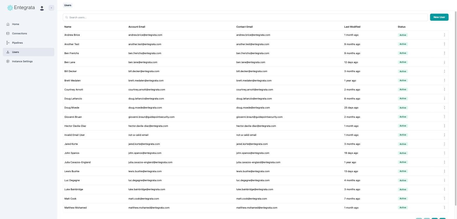
After
Access Control
Groups and Users
The Groups and Actors tabs became a menu on the last crumb. Actors is now labelled Users throughout this area, including the empty states and dialogs that used to say “actor”.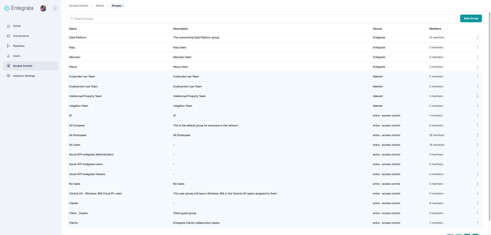
The groups list
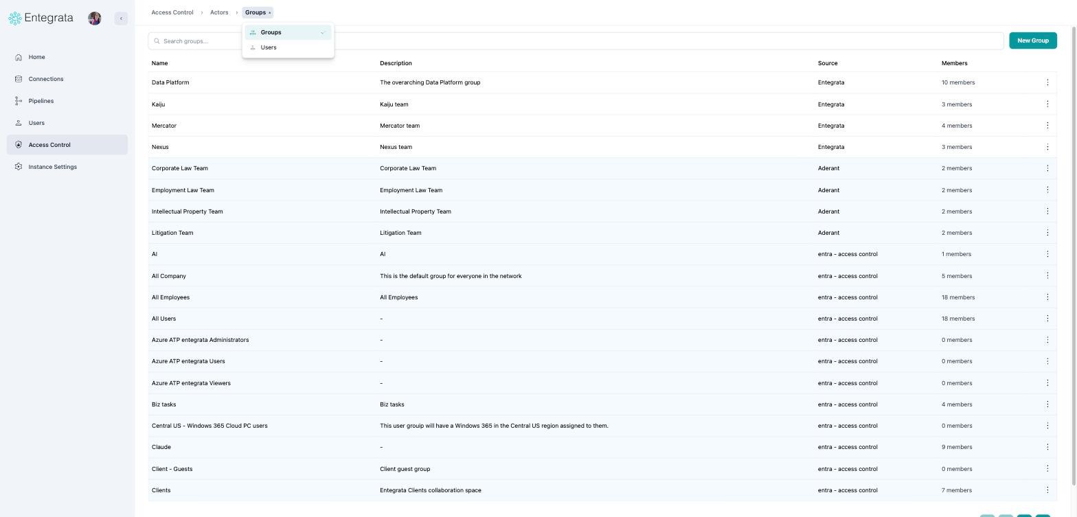
Switching between the two
A single group
The group name is a searchable switcher, the member tabs became a menu, and the two tools in the corner now open beside the member list instead of covering it.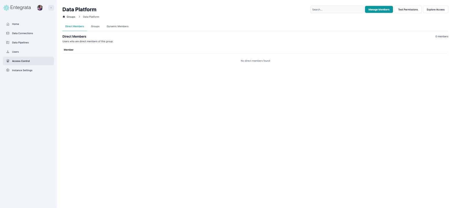
Before
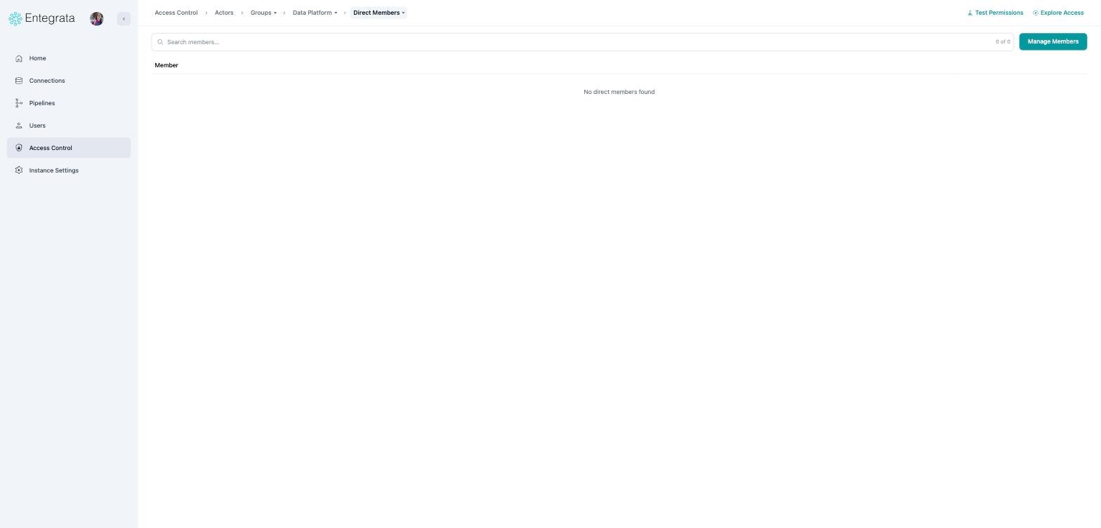
After
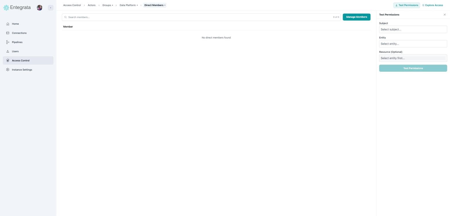
Test Permissions as a panel
Things to know
Panels open beside your work, not over it
Panels open beside your work, not over it
On a wide screen, Insights, History, Jobs, Settings, and the Access Control panels narrow
the page rather than covering it, so your list stays readable. On a narrower screen they
slide over the content instead. They close when you navigate.
Keyboard shortcuts on lists
Keyboard shortcuts on lists
Ctrl+Space jumps to the search box on any list. On a connection’s
resource pages, ⌘K opens the resource search palette.
Questions
If something you relied on is not where you expect, let us know through the support portal.Submit a ticket
Tell us what you were looking for and which page you expected to find it on.